USC Study: Climate change graphics are important, so make them simple
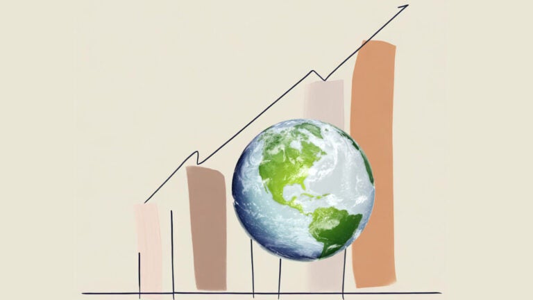
When the “hockey stick” graph, which illustrated a steep increase in global temperatures, was published in 1998, it reshaped the world’s understanding of climate change. A quarter-century later, with climate change now wreaking havoc around the world, graphics depicting global warming are more important than ever to inform policymaking.
However, a recent USC-led study reveals that some graphics developed for reports by the Intergovernmental Panel on Climate Change (IPCC) are too complex, even for the intended audiences of policymakers and practitioners.
Researchers recommend limiting each graphic, which the IPCC refers to as “figures,” and its title to one key message. The study produced a detailed checklist to improve the design of graphics that target policymakers and practitioners.